

This post includes selected client and public brand marks used for commentary and educational discussion. No endorsement or affiliation is implied.
Clear logo guidelines preserve consistency, recognition, and trust
A company’s logo is one of the most recognizable parts of its brand. It is often the first visual element people remember, and it carries the weight of the company’s reputation, personality, and credibility.
That is why logo usage guidelines are so important. They define how a logo should appear across print, digital, social, event, and marketing materials — and they help prevent the logo from being stretched, recolored, crowded, altered, or used in a way that weakens the brand.
In this third Lab Notes post, we’re looking at logo usage: how brands define the rules for presenting their logo clearly and consistently across print, digital, social, event, and marketing materials.
Since I have always been a fan of Milton Glaser, the creator of the iconic I ❤ NY logo, I appreciate when logo guidelines are clear, concise, and specific. The strongest systems leave very little room for confusion. They help everyone — designers, marketers, partners, vendors, and internal teams — understand exactly how the logo should be used.

Logo usage guidelines for color, scale, clear space, and misuse
Each rule helps protect the integrity of the logo and keeps the brand recognizable wherever it appears.
Logo color
Most company logos are limited to a small number of approved color variations. These often include a primary full-color logo, a white or reversed version, and a black or one-color version.
This keeps the logo flexible without allowing it to drift away from the brand.
For example, a full-color logo may be used on a white background, while a white logo may be used over a dark photo, solid color, or video frame. A black version may be reserved for limited production uses, such as forms, sponsorship listings, or one-color printing.
The important rule is that the logo should never be recolored randomly. Even a slight shift in color can make the brand feel inconsistent or unprofessional.
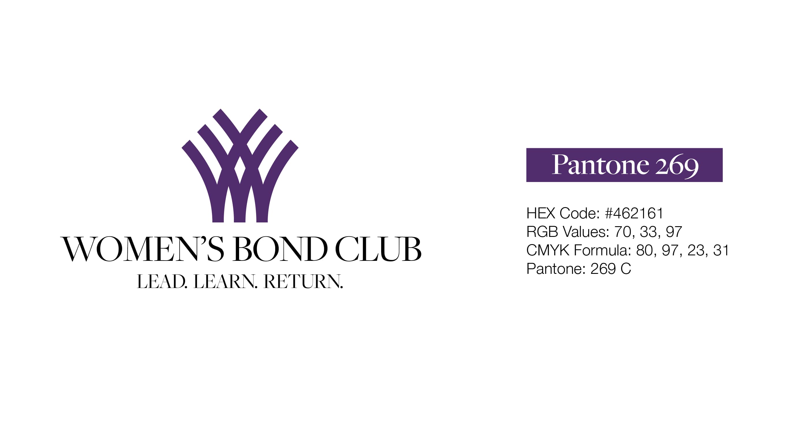
Example: Women’s Bond Club
The Women’s Bond Club logo needed to be recreated from scratch. Del Co Design Lab rebuilt the logo from scratch, identifying the structure of the mark, the type treatment, and—most importantly—the brand color. Their brand leans heavily on their color and needed to be a reliable shade that translated well online as well as printing.
Check out their website to see their color used in every manner of their identity.
Example: Blossom Catering Company
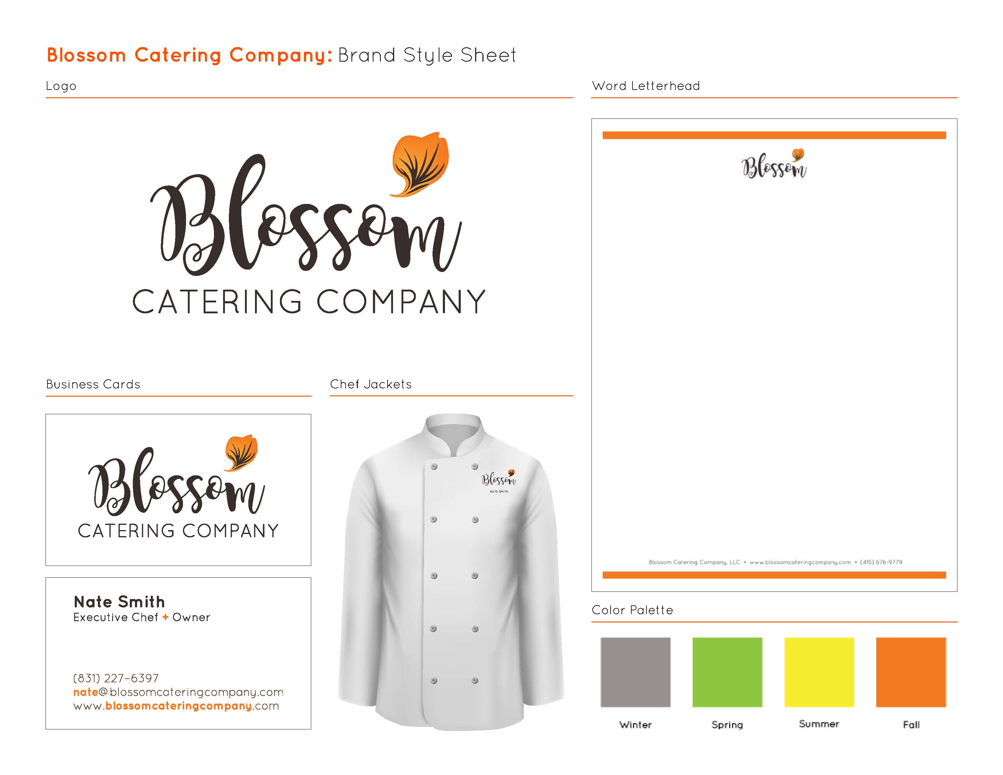
For Blossom Catering Company, the logo combines an expressive script wordmark, a clean supporting type treatment, and a small floral mark. The warm orange accent connects naturally to the brand’s seasonal palette and culinary personality. Even without a full formal logo usage guide, applying the logo consistently across business cards, letterhead, and chef jackets helps the brand feel polished, personal, and memorable. Visit their website to watch the hero video to see how the logo is put to use on aprons and name tags.
Logo scale
A logo needs to remain clear and legible at every size.
Brand guidelines often define a minimum reproduction size to make sure the logo does not become too small to read. This is especially important for logos with detailed icons, thin linework, small taglines, or registered trademark symbols.
A logo might look great on a website header or brochure cover, but become unreadable on a social media profile image, event badge, mobile ad, or presentation footer.
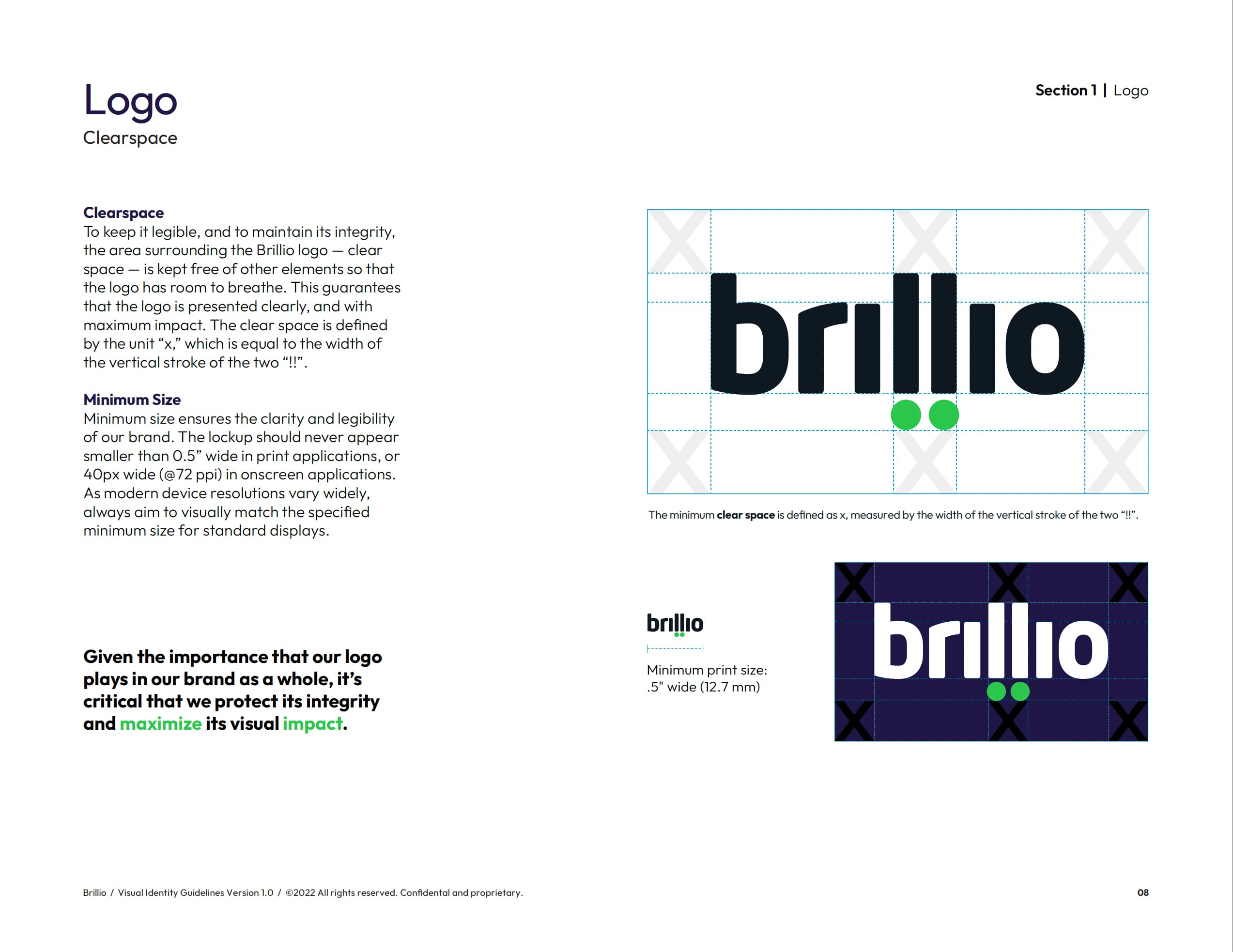
Example: Brillio
Brillio’s brand guidelines are a strong example of why minimum size matters. Their logo standards define how small the logo can appear so it remains legible and recognizable. That kind of rule is especially important across all devices and printing.
Del Co Design Lab created ebooks for Brillio using the “!!” at a large scale as a key element. See the ebooks highlighted in our portfolio.
Example: Cognizant
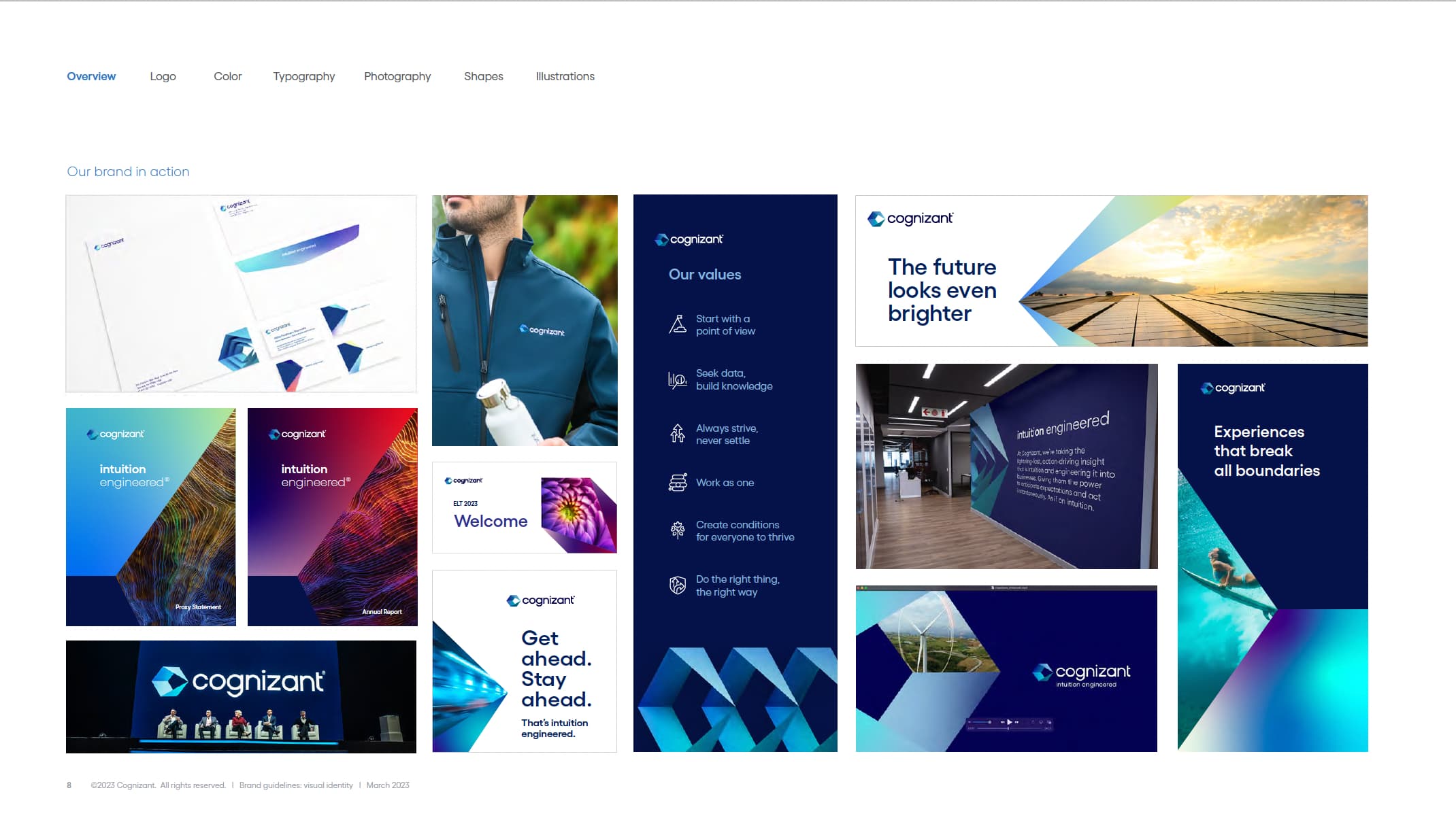
Cognizant’s brand guidelines also show how scale decisions can depend on use case. A primary logo with tagline may work well in brand-level applications, but a logo without the tagline may be more appropriate in small spaces where readability is the priority. The goal is not to force every logo element into every space. The goal is to preserve clarity.
See more examples of how Del Co Design Lab used Cognizant’s logo according to guidelines.
Logo clear space
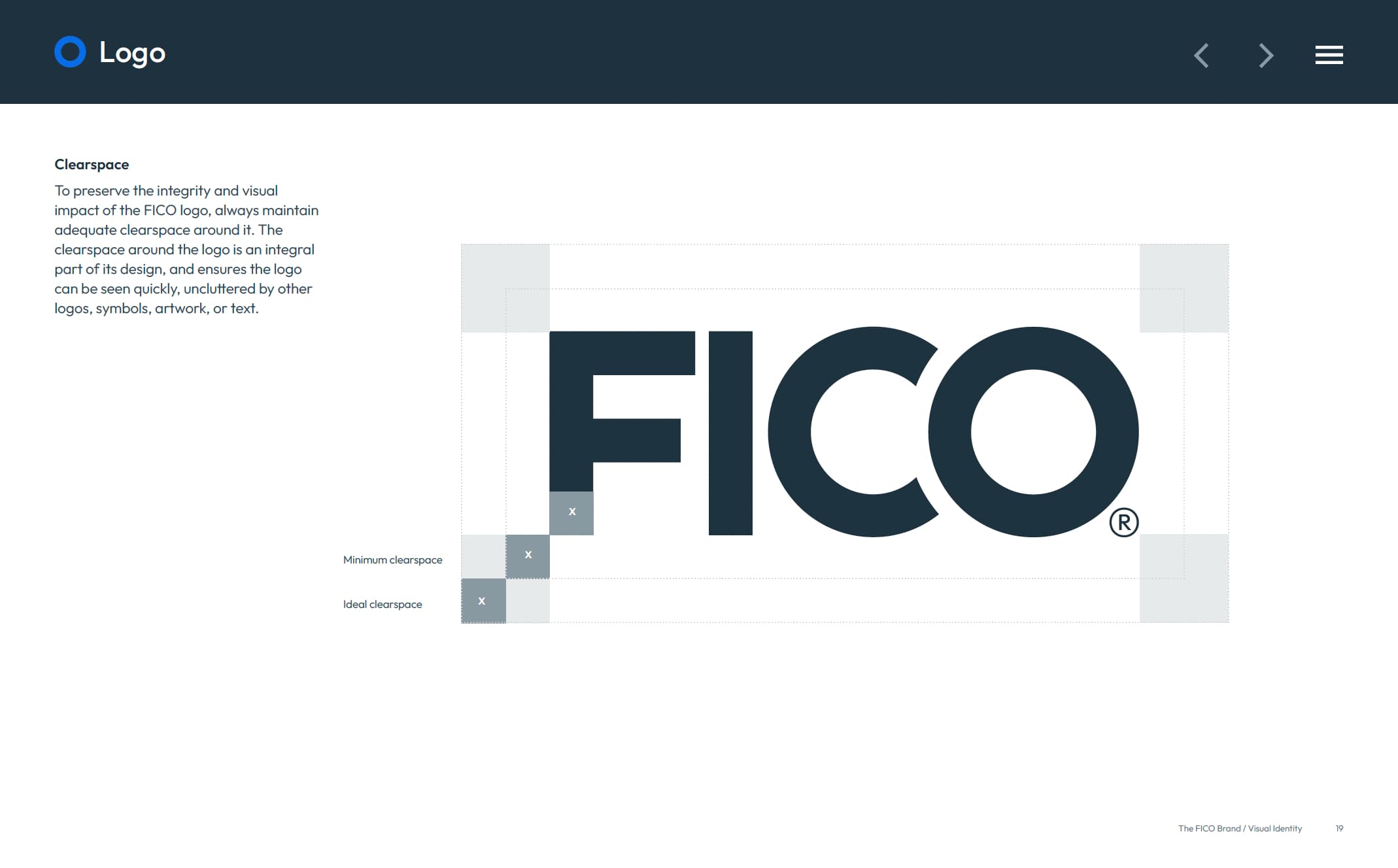
Clear space is the protected area around a logo that must remain free of text, graphics, photos, borders, or other visual elements. This ensures the logo has enough room to breathe and can be seen clearly.
Clear space is often defined by a measurement taken from part of the logo itself, such as the height of a letter, the width of an icon, or another internal unit. This makes the rule scalable and easy to apply in different formats.
Example: FICO
FICO’s brand guidance includes protected space and minimum size rules. That kind of instruction helps make sure the mark does not get crowded by typography, other logos, design elements, or surrounding content.
Example: IFC
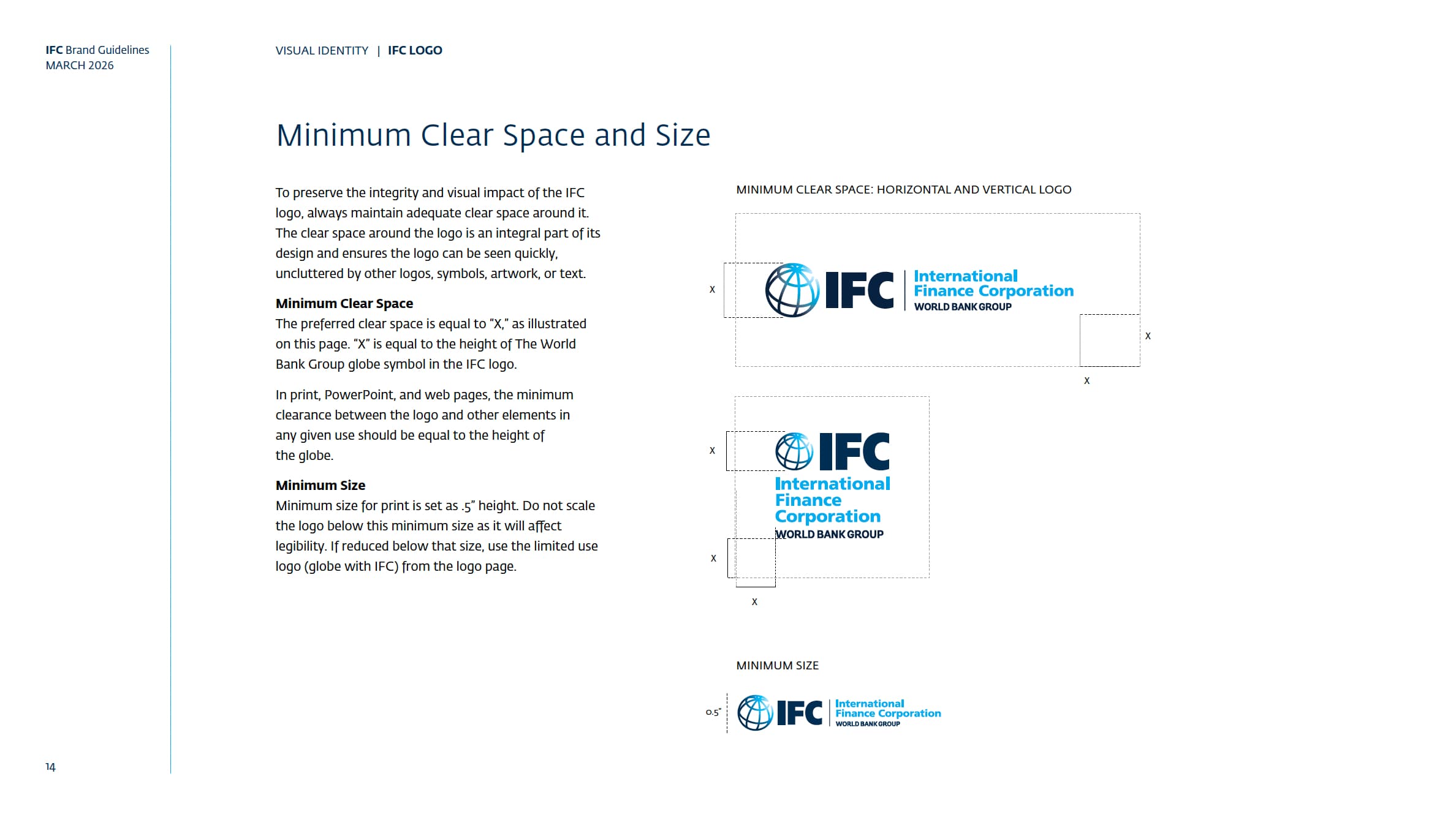
IFC’s guidelines define clear space using a specific measurement from the logo itself. This makes the rule easy to repeat across formats because the required space scales with the logo. Whether the logo appears on a report, banner, website, or co-branded layout, the same proportional logic applies.
Without enough clear space, even a correctly colored and properly scaled logo can feel crowded or diminished.
Trademarking and legal use
Trademark and legal usage rules are often dictated by a company’s legal or brand team, and they must be followed carefully.
Some brands require a registered trademark symbol or trademark symbol in specific uses. Others may require the symbol only on first mention, only with the primary logo, or only in certain markets, industries, or legal contexts.
These rules matter because logos are not just design assets. They are protected brand marks.
Example: Cognizant
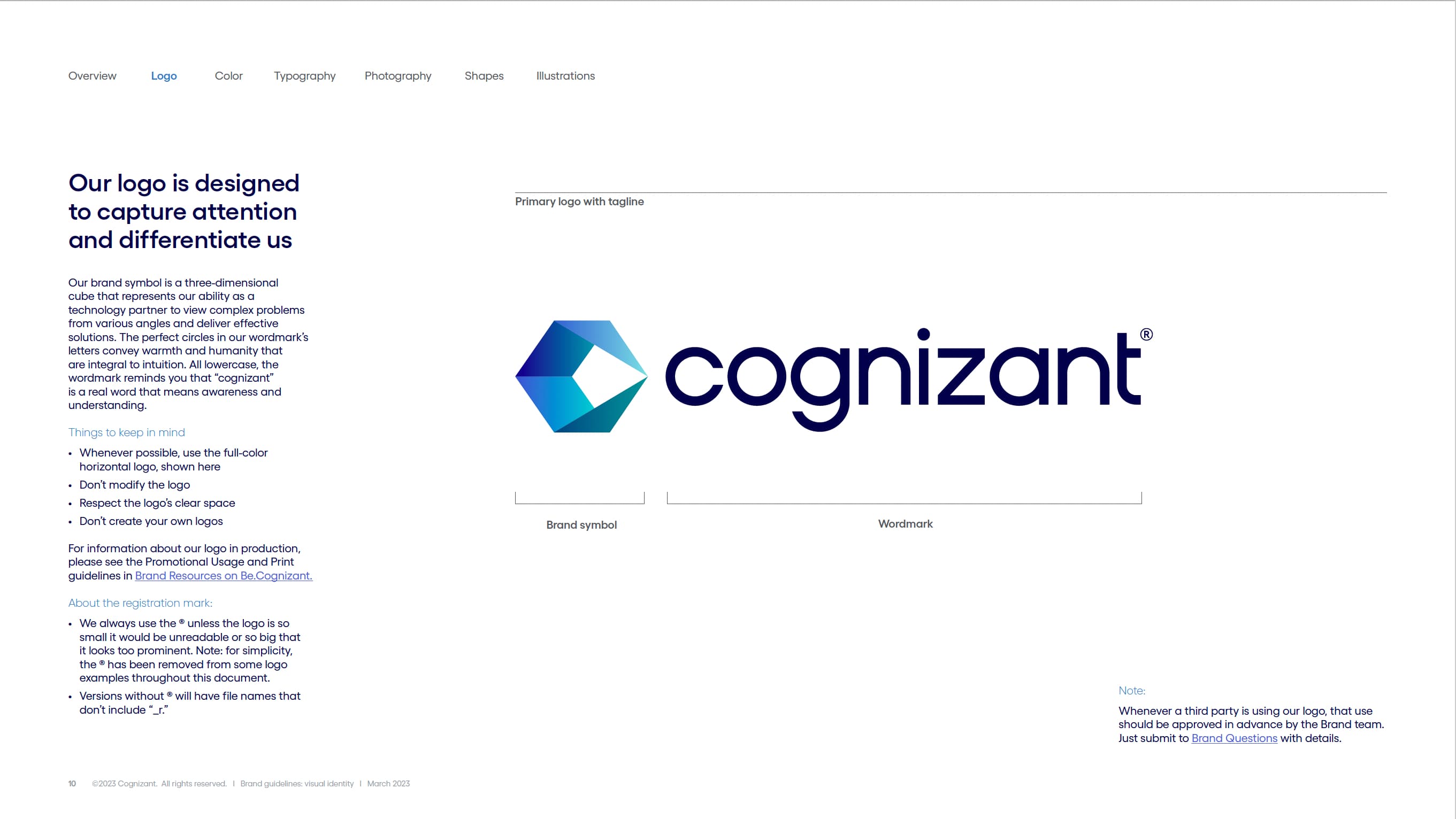
Cognizant’s guidelines include specific rules for the registration mark and when it should appear. This is a good example of how enterprise logo standards often go beyond design preferences. They also protect legal consistency across communications.
Example: NASA
NASA is another clear example of why legal use matters. Its insignia, logotype, and identifiers are protected, and public use must follow official guidance. When a mark becomes highly recognizable, protecting how it appears becomes even more important.
You can also check out the original standards manual here and see the full brand guidelines here.

What to avoid
Logo misuse is one of the fastest ways to weaken a brand.
Most logo guidelines include examples of what not to do because visual examples are often easier to understand than written rules alone.
Common logo mistakes include:
Changing the logo color

Stretching or compressing the logo

Rotating or skewing the logo

Changing the typeface

Adding shadows, outlines, or effects

Placing the logo on a busy background

Cropping the logo
Rearranging logo elements

Using an outdated version

Placing the logo too close to other elements

Creating unauthorized logo variations
Adding duplicate elements

Example: C&R Software
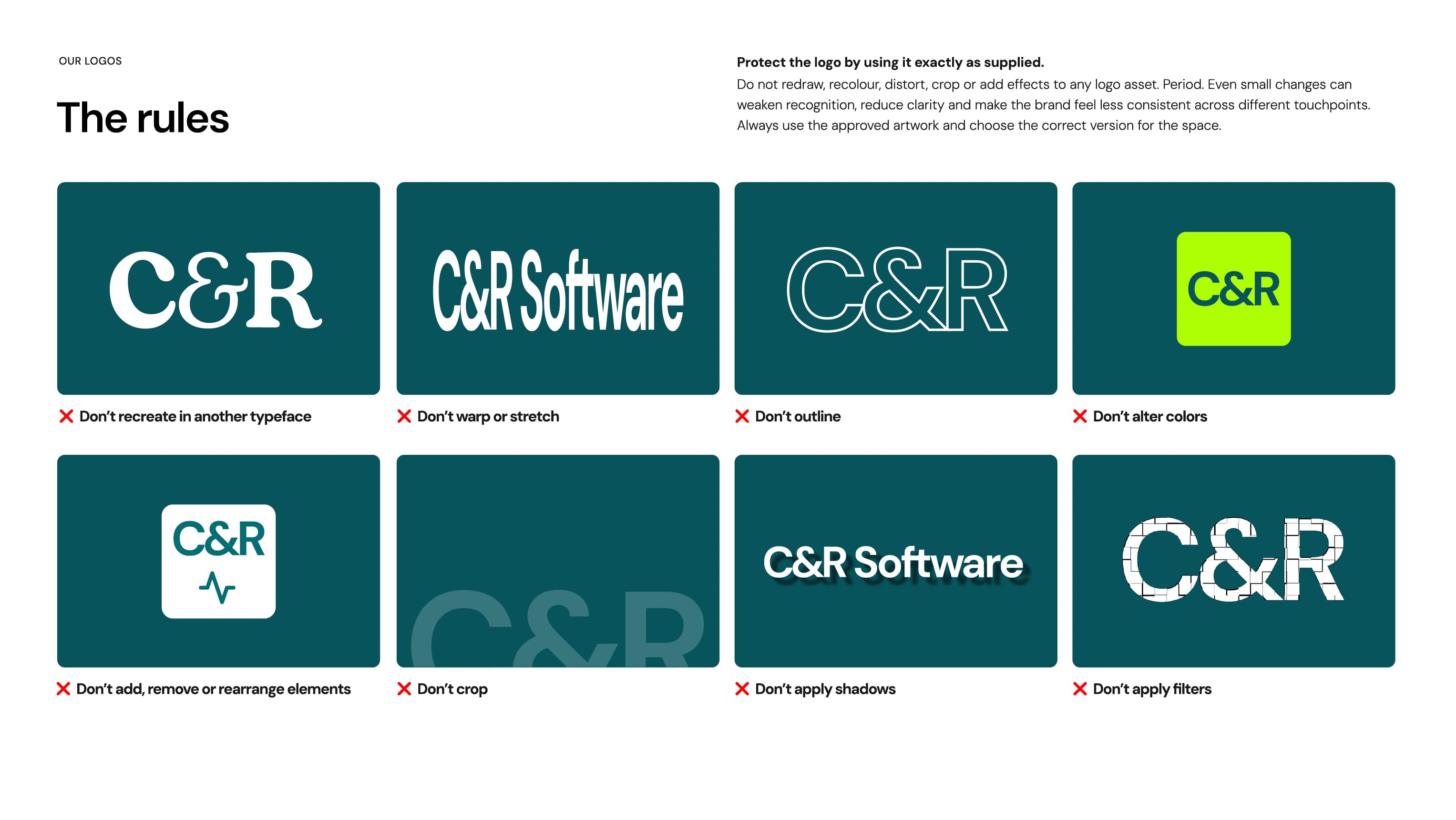
C&R Software includes guidance to not redraw, recolor, distort, crop, or add effects to any logo asset. These “don’t” examples are valuable because they remove guesswork. They show users exactly where the boundaries are.
Example: Oracle
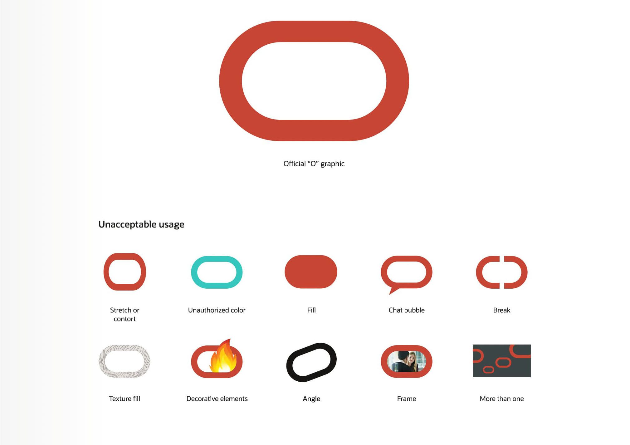
Oracle’s guidelines also include incorrect logo usage as part of the logo system. For large organizations, this type of guidance is especially important because many teams, partners, and vendors may be creating materials across different channels.
Why logo usage guidelines matter
A logo is carefully designed to communicate a specific identity. Every color, proportion, letterform, spacing decision, and symbol has a purpose. When those details are changed, the brand message changes too.
Good logo guidelines make correct usage easy. They provide approved files, formats, color options, spacing rules, scale requirements, placement guidance, trademark instructions, and misuse examples so teams can apply the logo consistently.
For smaller brands, this may be a concise style sheet. For larger organizations, it may be a full visual identity system. Either way, the goal is the same: protect recognition and build trust.
At Del Co Design Lab, we help clients apply logo usage guidelines across white papers, e-books, presentations, social graphics, event materials, signage, and other marketing touchpoints. Our goal is to make every piece feel polished, consistent, and unmistakably on brand.
Explore our Portfolio to see examples of brand-aligned design, and check back for the next Lab Notes post, where we’ll look at imagery in brand guidelines.
Designer’s Takeaway
Logo guidelines are not just about protecting artwork. They are about protecting brand equity.
Helpful logo resources
For a deeper look at logo fundamentals, these resources are helpful:

UCDA: Logo Design — Fifteen Golden Rules for Crafting Logos
A practical guide to what makes a logo effective, from simplicity and memorability to flexibility and long-term use.
UCDA

Adobe: How to Design a Logo
A beginner-friendly overview of the logo design process, including research, concept development, refinement, and brand consistency.
Adobe
Frontify: Logo Usage Guidelines
A helpful resource for understanding what should be included in logo usage guidelines, including clear space, color variations, spacing, and approved applications.
Frontify
Branding Toolbox: Logo Usage Guidelines
A practical guide to organizing logo files, usage rules, file formats, approval processes, and how logo standards fit into a broader brand system.





 Simply Styled Sites