

lab Notes
design insights for stronger brand communication
Welcome to Lab Notes, a collection of design insights from Del Co Design Lab. This is where we share practical thinking about branding, visual identity, content design, marketing materials, creative process, and the details that help businesses communicate with more clarity and consistency.
As a graphic design studio focused on B2B marketing materials, we often work with brands that need to explain complex products, services, data, and ideas. Strong design helps make that communication easier to understand. The right color system can build recognition. The right typography can create hierarchy and trust. The right image can shape perception. The right layout can guide a reader through a white paper, e-book, infographic, presentation, or campaign asset without making the content feel overwhelming.
Explore the latest Lab Notes below, and check back for more design insights on branding, content design, visual communication, and the creative decisions that help businesses look more polished and professional.

Your logo is not a flexible suggestion
Your logo is not a flexible suggestion

Typography is your brand’s visual voice
Typography is your brand’s visual voice
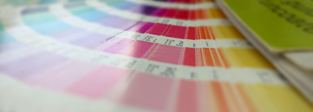
Why brand color is more than a swatch
Why brand color is more than a swatch
These Lab Notes design insights are written for marketing teams, business owners, content leaders, and creative partners who want to better understand how design decisions affect brand perception. Each post looks at part of the creative process and explains how design can support stronger, more consistent communication.
At Del Co Design Lab, we believe good design is not just about making something look better. It is about making ideas clearer, messages stronger, and brands easier to recognize. Lab Notes gives us a place to share that perspective, along with helpful resources, real-world examples, and practical takeaways from our design work.




 Simply Styled Sites