

creating clarity, consistency, and personality
Before someone reads the full message, type has already started communicating. It can feel refined or casual, traditional or modern, playful or serious. In the B2B marketing materials we design most often — white papers, e-books, infographics, presentations, reports, and campaign assets — typography usually needs to feel professional, support the brand personality, and make the content easy to understand.
That is why brand typography guidelines are such an important part of a strong design system. They help define how type should be used across logos, headlines, body copy, charts, captions, quotes, presentations, and long-form marketing materials so every piece feels clear, consistent, and recognizable.
In this second post of our Lab Notes series on brand guidelines, we’re looking at how typography helps create structure, hierarchy, and personality across a brand’s visual identity.
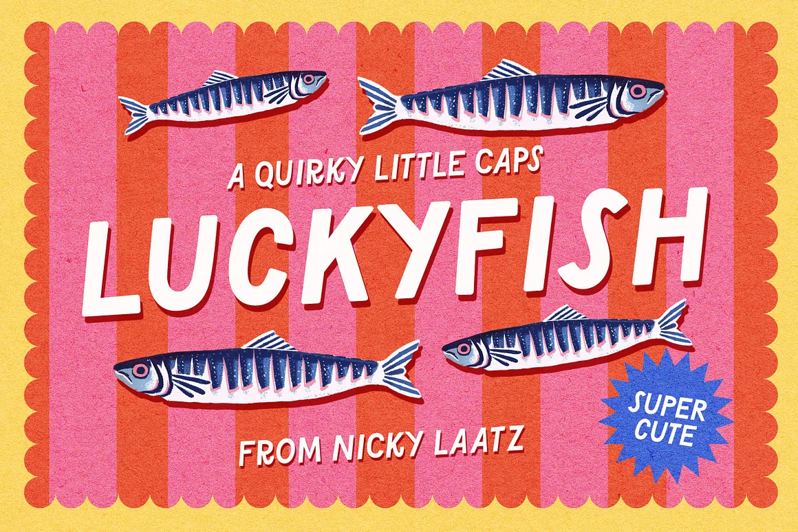
Source: Creative Market Lucky Fish Font
What are brand typograpHy guidelines?
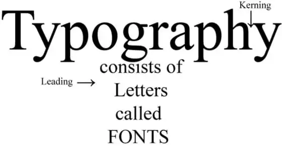
Typography is the style, appearance, and arrangement of type. It includes the typefaces a brand chooses, the font styles it uses, and the way text is organized across a layout.
A few basic definitions help clarify the difference:
Typography is the overall art and system of arranging type.
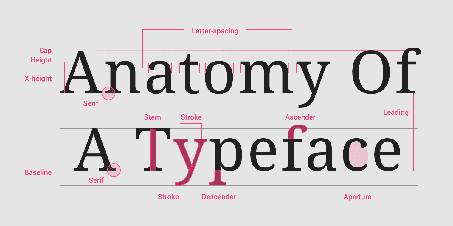
A typeface is the design family, such as a serif, sans serif, script, monospaced, or display typeface.
A font is a specific style within that typeface, such as regular, bold, italic, condensed, or light.
For example, a brand may use one typeface for headlines and another for body copy. Within those typefaces, the designer may use different fonts or weights to create contrast and hierarchy.
Why brand typography guidelines Matter
Typography does more than make words readable. It helps shape how a brand is perceived.
A serif typeface can feel established, editorial, or traditional. A geometric sans serif can feel modern, clean, and precise. A display typeface can add personality, but it often needs to be used carefully so it does not overpower the message.
For brands with complex content, typography is especially important. A strong typographic system helps readers scan, understand, and remember information. It gives structure to dense copy, makes charts and captions easier to follow, and helps the audience move through the content without feeling overwhelmed.
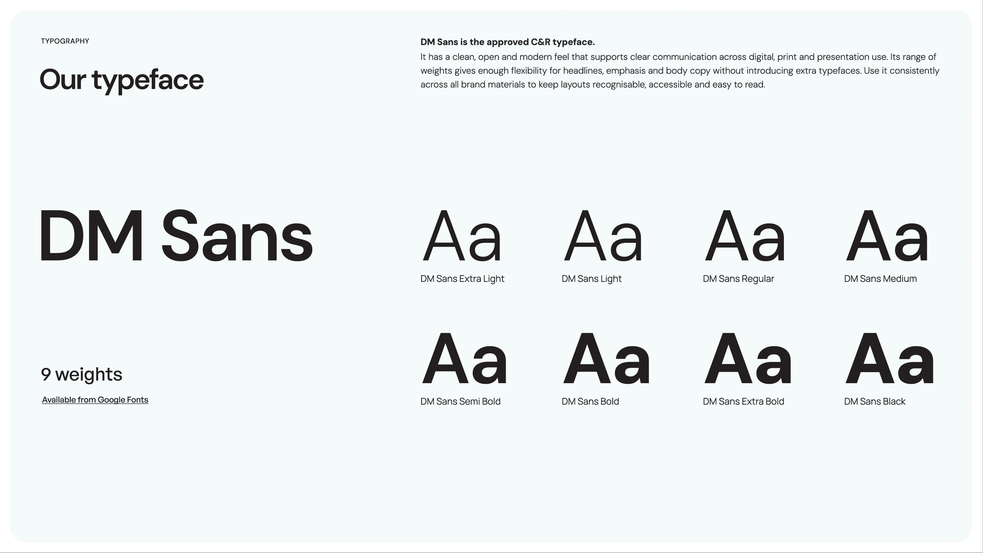
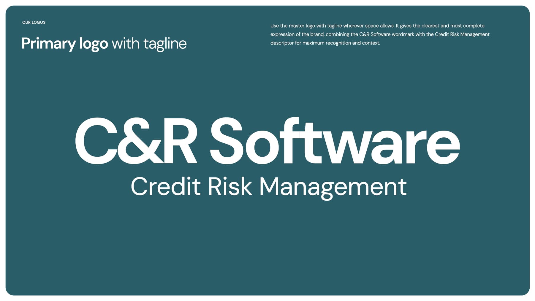
Below you can see C&R Software’s typeface has a broad selection of weights to give flexibility with headlines and body copy so a secondary typeface isn’t necessary. See how flexible their typeface can be on the C&R Software portfolio page.
Good brand typography guidelines should define:
- Approved typefaces
- Font weights and styles
- Headline, subhead, and body copy usage
- Line spacing and paragraph spacing
- Text color rules
- Callout, quote, caption, and chart label styles
- What not to do, such as stretching, compressing, or substituting fonts
The goal is not to limit creativity. The goal is to create a system that allows every piece of content to feel connected, consistent, and unmistakably on brand.
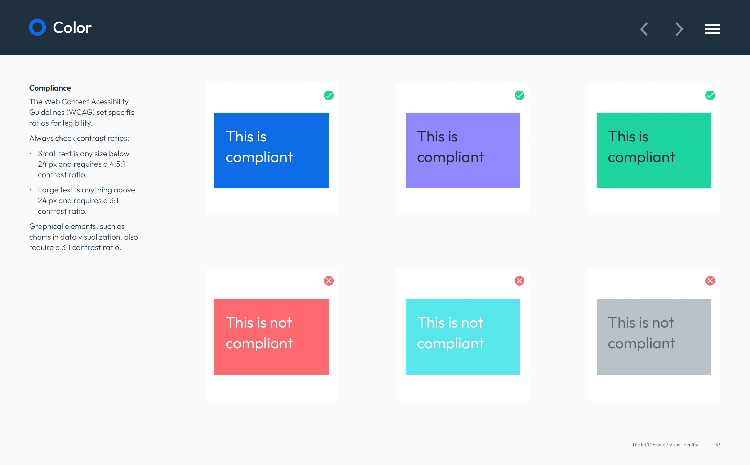
Below is an example of FICO’s typography brand guidelines that make great use of WCAG to ensure legibility with their typography on colored backgrounds. Use the WebAIM Contrast Checker, which is highlighted in the helpful resources in our Why brand color is more than a swatch blog post.
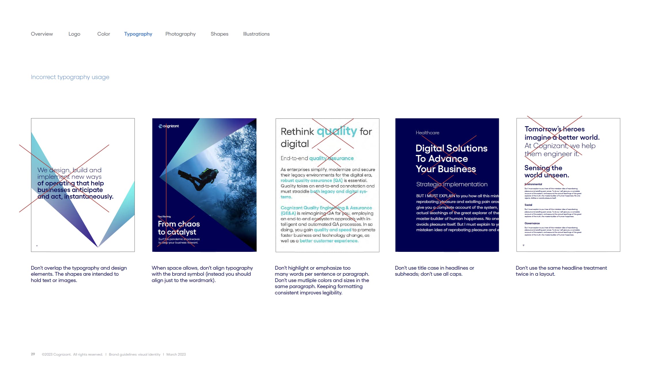
The image below shows some incorrect typography usage for Cognizant’s brand typeface. Many times its easier to show what not to do in brand guidelines. You can see correct typography in action on the Cognizant portfolio page.
applying brand typography guidelines with intentioN
At Del Co Design Lab, we take typography seriously. There is no such thing as a “close enough” font substitution when brand guidelines are involved.
Using the wrong typeface can make even a polished layout feel disconnected from the brand. But the bigger challenge is not simply choosing the correct font. The real design work comes from knowing how to use it.
When working with typography, we consider:
- Proper typeface
- Correct scale and hierarchy
- Balance of type weight and style
- Relationship between type color and content
- Technical details of spacing, alignment, and readability
- How the type supports the brand voice
Strong guidelines often provide direction for these details. But in many real-world projects, designers also need to make thoughtful decisions based on the content, format, and audience.
This is where style systems become incredibly valuable. Creating standard paragraph styles, heading styles, chart styles, and callout styles can save time, improve consistency, and speed up production across white papers, e-books, brochures, presentations, and digital graphics.
Typography creates hierarchy
One of the most important jobs of typography is to create hierarchy.
Hierarchy tells the reader where to look first, what to read next, and which information matters most. It uses size, weight, color, spacing, and placement to organize the page.
There are times when brand guidelines need a deeper level of definition, especially for long-form materials like white papers, research reports, and e-books. That is where Del Co Design Lab helps turn broad typography rules into a practical working system.
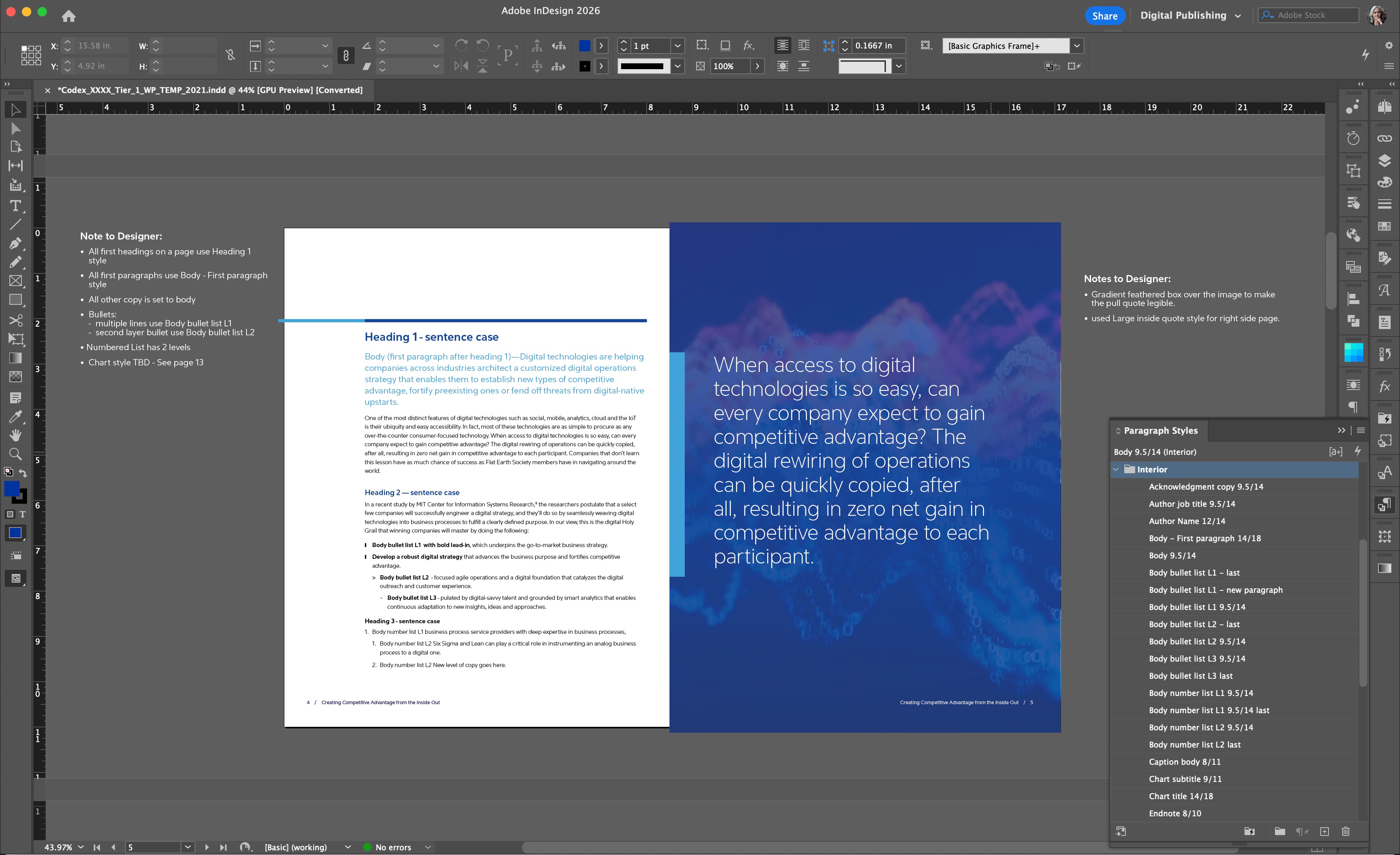
This screenshot shows an actual Adobe InDesign template created for a Cognizant white paper. Paragraph styles were built for headings, body copy, bullets, numbered lists, captions, charts, quotes, and other recurring content types. By defining these styles upfront, every page stays consistent — no matter how long or complex the document becomes.
This kind of behind-the-scenes structure saves production time, reduces formatting errors, and helps ensure the final piece feels polished, professional, and fully aligned with the brand.
Cognizant white paper title page
In a white paper, hierarchy helps separate the report title, primary headings, section headers, body copy, pull quotes, statistics, captions, footnotes, and calls to action.

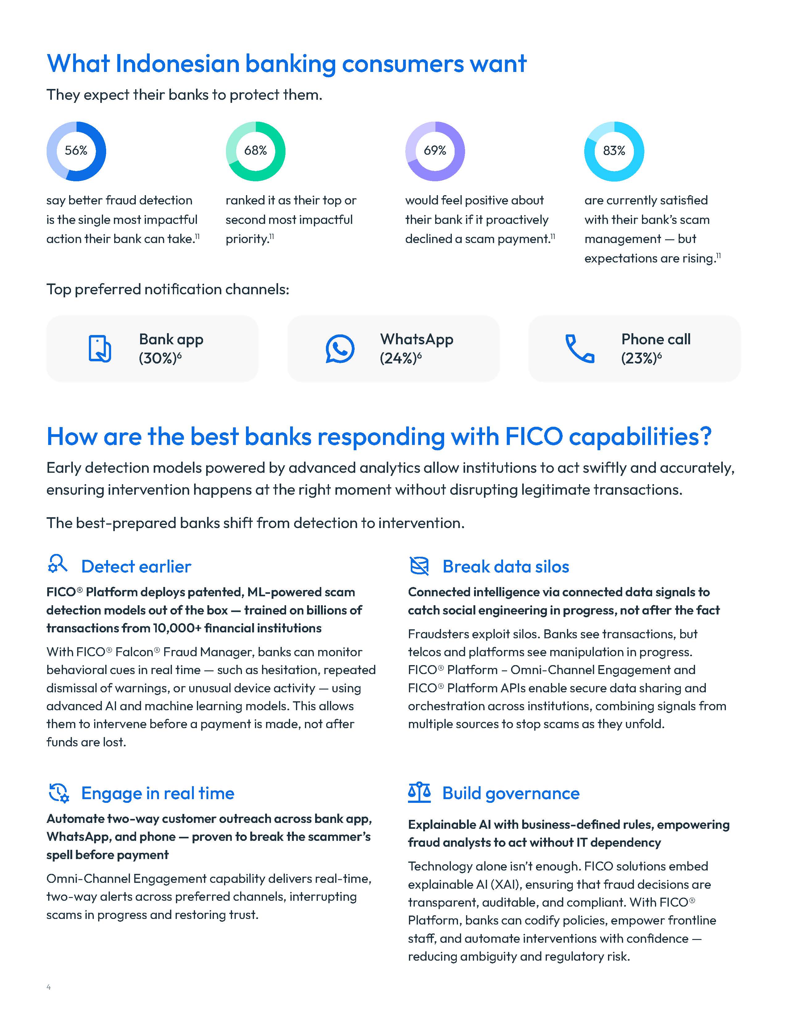
FICO infographic secondary page
In an infographic, hierarchy is key to help readers understand the story quickly. The right scale can make complex information feel structured, and easy to follow.
The hierarchy is easy to see in the GE posters below. The headline is the largest font while subheads are set in the electric blue to differentiate them from the supporting bullets and content. See more examples on the GE portfolio page.
GE event banners


BraNd typography guidelines in practice: two client exaMples
Customer example: Blossom Catering Company
Blossom Catering Company is a good example of how typography can help shape a brand’s personality from the very beginning.
For this Napa-based catering company, the goal was to create a visual identity that felt personal, elevated, and approachable. The logo uses an expressive script style for “Blossom,” paired with a clean, widely spaced sans serif for “Catering Company.” That contrast helps the brand feel both handcrafted and professional.
The script type gives the logo warmth and movement. It feels personal, creative, and connected to the artistry of food. The supporting sans serif balances that expression with clarity, making the full name easier to read across practical applications like business cards, letterhead, and chef jackets.
This is where typography becomes more than style. A catering brand needs to feel welcoming and memorable, but it also needs to be clear and polished. The type choices help communicate that balance.
The Blossom identity also shows how typography works with other brand elements. The floral icon, seasonal color palette, and clean supporting layouts all reinforce the same personality: fresh, warm, refined, and thoughtfully crafted.

Customer example: C&R Software
C&R Software is a very different typography example because the brand needed to communicate strength, clarity, and credibility in a complex B2B software market.
When developing the C&R Software logo, one of the most important decisions was choosing the right typeface and the right ampersand. The ampersand had to feel integrated, balanced, and ownable — not like an afterthought between two letters.
The selected typeface, DM Sans, gave the brand a clean and modern foundation. Its open, geometric forms feel professional and approachable, which supports C&R Software’s positioning in collections, recovery, and financial technology.
There was also a happy coincidence in the choice: DM is the acronym for Debt Manager, C&R Software’s main product. While that was not the reason for choosing the typeface, it created an extra layer of relevance that made the system feel even more connected to the company.
For C&R Software, typography had to work beyond the logo. DM Sans needed to support presentations, white papers, and other marketing materials. That flexibility made it a strong choice for a brand that needed consistency across many content formats.
Designer’s Takeaway
Typography choices should always serve the brand’s personality, audience, and real-world applications.
Helpful typography resources
For a deeper look at typography fundamentals, these resources are helpful:
Creative Market: What Is Typography?
Best for explaining the basics in an approachable way: type terminology, readability, spacing, hierarchy, and how type affects design.
Adobe Fonts
Best for professional font exploration, licensing, and real-world design use across Adobe apps and websites. ms.
Google Fonts Knowledge
Best educational resource for learning typography principles, pairing, readability, and web-friendly type.
Material Design: Understanding Typography
A practical guide to typography in digital design, including hierarchy, brand presence, readability, and how type supports a better user experience.

brand typography guidelines, consistency, and better content design
At Del Co Design Lab, we help clients apply brand typography guidelines across white papers, e-books, infographics, presentations, reports, campaign graphics, and other B2B marketing materials.
For brands with complex ideas, typography is not a small detail. It is one of the tools that turns information into communication.
Need help turning brand typography guidelines into polished, consistent marketing materials? Del Co Design Lab helps B2B brands create white papers, e-books, infographics, presentations, campaign graphics, and visual identity systems that are clear, professional, and built to support sales and marketing goals.
Explore our Portfolio to see examples of brand-aligned typography and content design or Contact Del Co Design Lab to start a conversation..
Check back for Part 3 of Lab Notes, where we’ll look at logo usage in brand guidelines.




 Simply Styled Sites