


Build recognition, trust, and clarity across every touchpoint
At Del Co Design Lab, we help clients apply brand color guidelines in a way that feels clear, consistent, and engaging. A strong color system gives every presentation, white paper, infographic, e-book, social graphic, and campaign a recognizable visual thread.
In this six-part Lab Notes series, we’ll break down the key design elements that help keep a brand recognizable and distinct: 1. Color 2. Typography 3. Logo 4. Imagery 5. Illustration 6. Layout
Why brand color guidelines matter
Color is often the first thing people notice. It can make a brand feel bold, calm, trustworthy, modern, human, or highly technical before a single word is read.
It is also one of the reasons I became a designer. A college Color Theory class sparked my interest in how color affects perception, and I have been fascinated by it ever since.
Most companies define specific brand colors, often including Pantone, CMYK, RGB, and HEX values. These colors are not chosen randomly. They are selected to create a specific feeling and help audiences recognize the brand instantly.
Famous brands known for their color




Google’s multicolor logo breaks traditional design rules on purpose. Its primary colors feel familiar, while the green “L” adds a playful twist.
McDonald’s yellow Golden Arches and red background make the brand easy to spot and instantly recognizable.
Coca-Cola’s brand color is unique because it is a proprietary, “secret formula” red, not a standard Pantone shade.
Starbucks’ green and white logo reflects freshness, growth, and a premium coffee experience.
Applying brand color guidelines to client work
Customer example: C&R Software
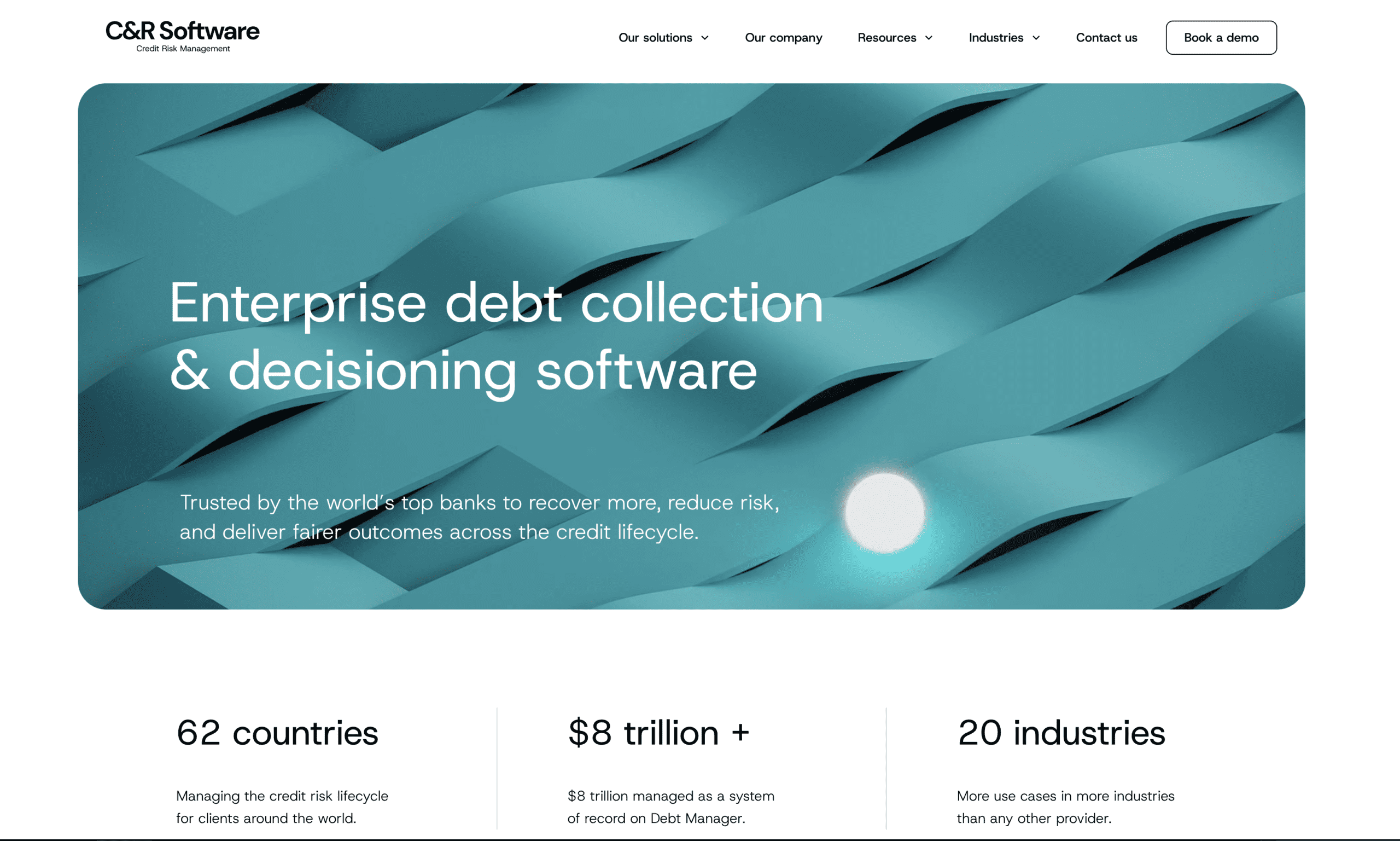
The C&R Software weave background image is a great example of color and texture working together to reinforce brand perception. Their brand color guidelines help keep complex materials such as white papers, presentations, web graphics, and social media assets visually connected across every touchpoint.
The image uses layered teal tones in an interwoven pattern that feels structured, dimensional, and modern. This creates a visual language that suggests connection, flow, systems thinking, and stability — all qualities that are highly relevant for a technology company operating in the credit, collections, and recovery space.

Teal is especially effective here because it bridges two important qualities: the trust and dependability often associated with blue, and the clarity and balance associated with green. The result feels both technical and approachable.
The woven form also adds meaning. Rather than relying on a flat background color, the texture gives the impression of integration and movement, which aligns well with a brand focused on managing complex processes and creating smoother, more connected customer outcomes.
Presentation design

Website
Social media

White paper
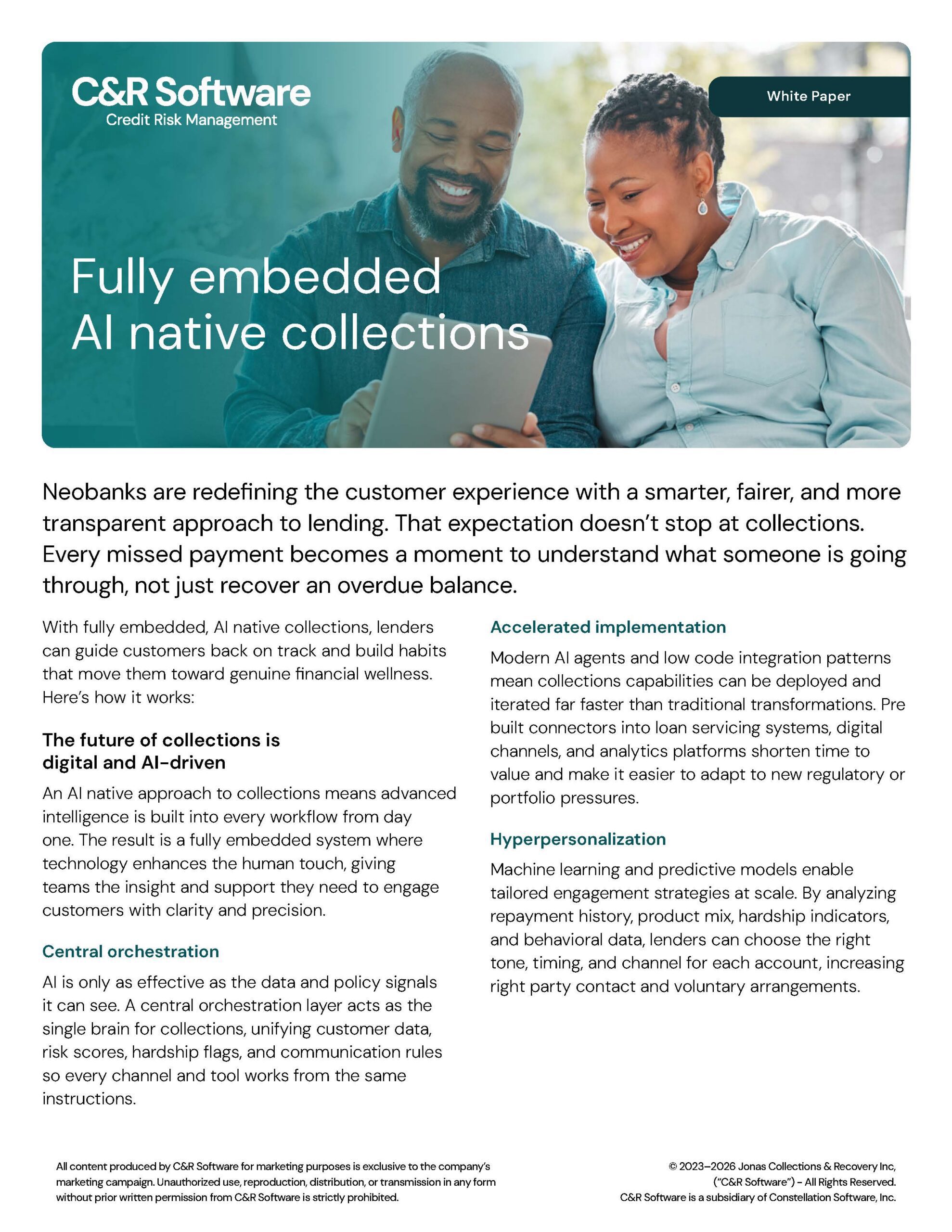
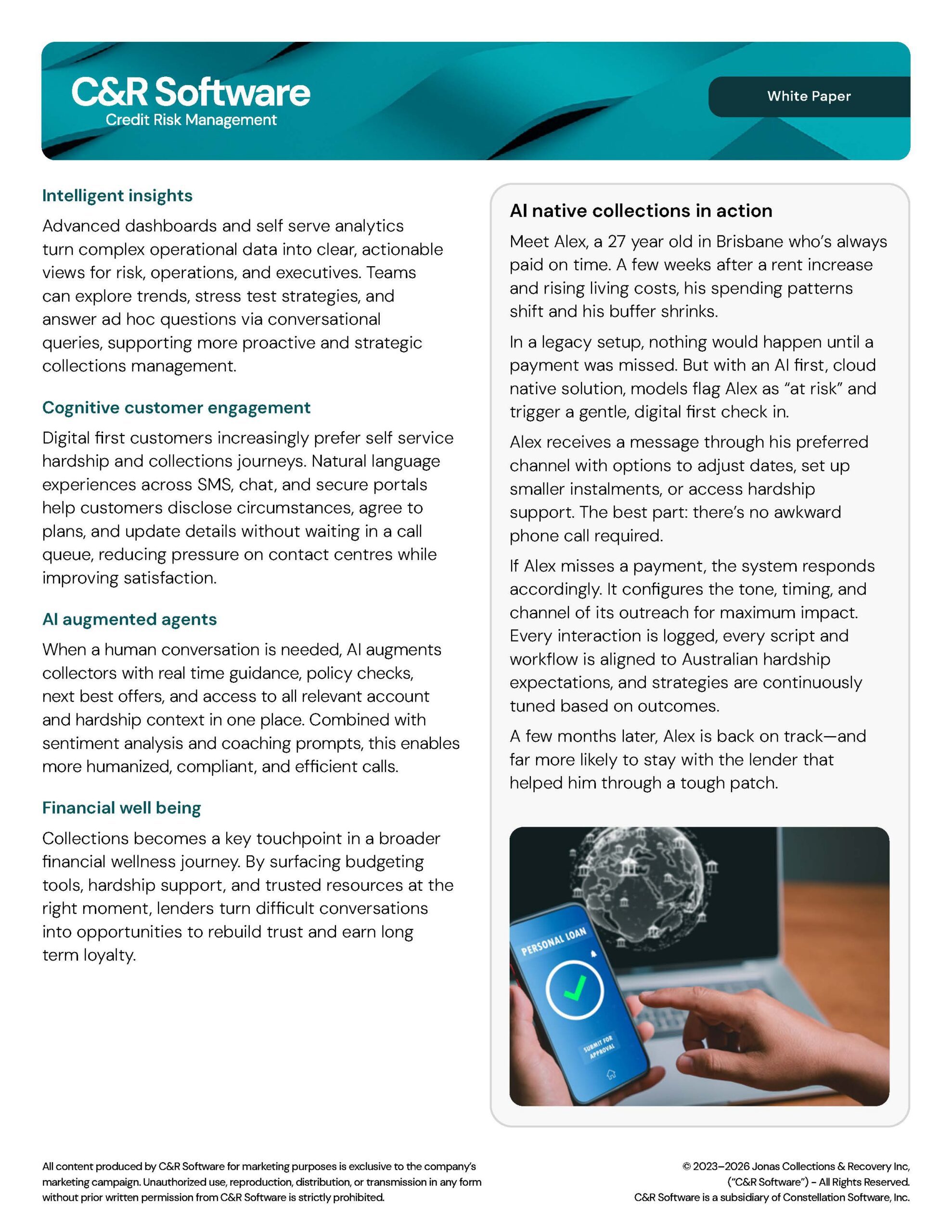

In a white paper, presentation, or case study, a background treatment like this can help establish mood and brand consistency without overpowering the message. It provides visual interest while still supporting readability and professionalism.
This is a strong reminder that color does not work alone. It works in combination with shape, pattern, contrast, and composition to create a complete brand experience.
See more examples of our B2B content design in our Portfolio.
Customer example: Cognizant
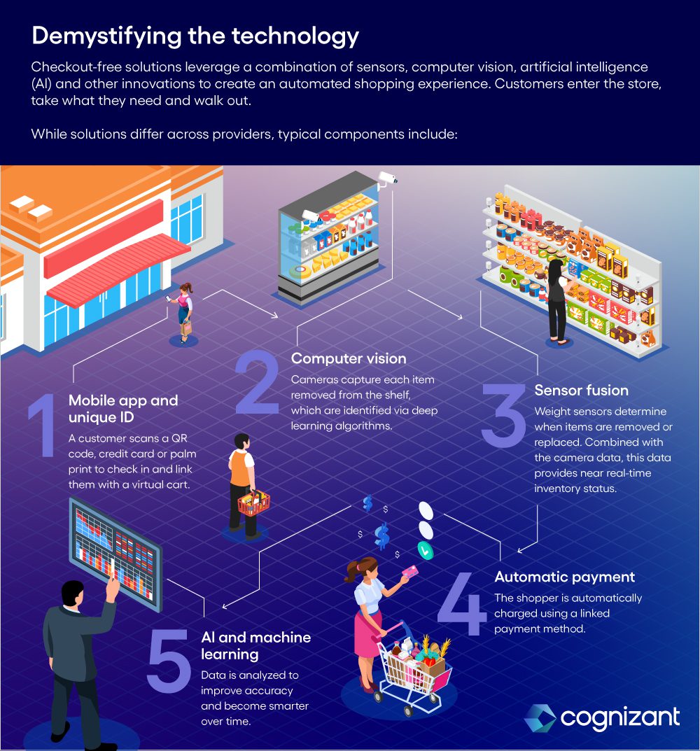
Cognizant’s use of gradients shows how brand color guidelines can evolve beyond flat swatches into a more dimensional visual system and capture the concept of intuition.
Their color palettes reflect human intuition when millions of bits of information are processed through the mind to form a new idea. This process is not linear or precise. They composed their gradients with several of their brand colors that create movement and an overall organic feel. Just like intuition.



In e-books and blog infographics, gradients help Cognizant’s brand feel more dynamic than a flat color palette alone. A blue-to-teal gradient suggests technology, intelligence, movement, and digital transformation. A darker blue-to-red creates energy and urgency, making it useful for section dividers, or bold data callouts. The lighter blue-to-green gradient gives the feeling of optimism and approachability.
Ebook



Blog infographics


Using brand color guidelines strategically
When applying brand colors, we consider:
Primary brand colors are used correctly
When to use secondary colors
Balance of color vs white space
Contrast between colors
Clarity wins over complexity
This is where brand guidelines become more than a checklist. A designer has to interpret them thoughtfully.
Even when every color technically comes from the approved palette, a layout can still feel off-brand if the balance is wrong. Too much accent color can make a serious topic feel less credible. Too little contrast can make important information hard to read. Too many competing colors can make a complex topic feel even more complicated.
Color also affects communication. If a chart is difficult to understand, the insight gets lost. If a headline does not stand out, the message loses impact. But when color is used with intention, the brand feels confident, clear, and recognizable.
Designer’s Takeaway
Brand color is not just about using the correct swatch — it is about creating a visual system that supports recognition, meaning, and consistency across every touchpoint.
Helpful color resources
For a deeper look at how color works in design, these resources are worth exploring:

Adobe Color
A useful tool for exploring color palettes, harmony rules, and color relationships.
Color.Adobe.com
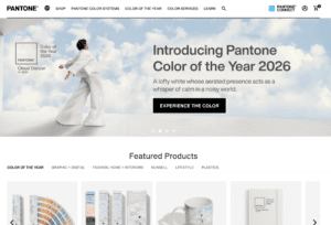
Pantone
A strong resource for understanding color standards, trends, and how color influences branding and design.
Pantone.com
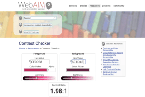
WebAIM Contrast Checker
A practical tool for checking readability and making sure color combinations meet accessibility standards.
WebAIM Contrast Checker

Shutterstock: Complete Guide to Color in Design
A helpful overview of color theory, color meaning, the color wheel, and how designers use color to create visual impact.
Color Theory: A Comprehensive Guide for Designers
Brand color guidelines, readability, and consistency
At Del Co Design Lab, we help clients apply their brand guidelines across social media, white papers, e-books, infographics, presentations, and event graphics.
For brands like C&R Software and Cognizant, that means creating materials that feel modern, trustworthy, and easy to understand while still respecting the complexity of the industry.
Need help translating your brand guidelines into polished white papers, e-books, presentations, or campaign materials? Del Co Design Lab helps B2B brands create content that is clear, consistent, and built to support sales and marketing goals.
Explore our graphic design services to see how we support white papers, e-books, infographics, presentations, and campaign materials.
Check back for Part 2 of Lab Notes, where we’ll look at typography.





 Simply Styled Sites